
Work
About
Contact

Work
About
Contact
Case Study Overview
Case Study Overview
SIAP is an internal web-based platform used to manage maintenance requests under a state-owned company. It allows employees (requesters) to submit maintenance requests for facilities, equipment, or infrastructure that need fixing or improvement. The process involves multiple roles such as Requesters who submit maintenance issues, Approves or coordinator who validate and assign tasks, and Vendors who carry out the work.
SIAP is an internal web-based platform used to manage maintenance requests under a state-owned company. It allows employees (requesters) to submit maintenance requests for facilities, equipment, or infrastructure that need fixing or improvement. The process involves multiple roles such as Requesters who submit maintenance issues, Approves or coordinator who validate and assign tasks, and Vendors who carry out the work.
Position
Position
UI/UX Designer
UI/UX Designer
Timeline
Timeline
Okt - Nov 2024
Okt - Nov 2024
(2 months)
(2 months)
Tools Used
Tools Used
Figma
Figma
Problem Statement
Problem Statement
Although the existing SIAP functional, fell short in delivering a seamless and transparent experience for their users. With multiple roles involved in each maintenance request from submission to resolution, the system faced several issues that affected user experience and overall efficiency:
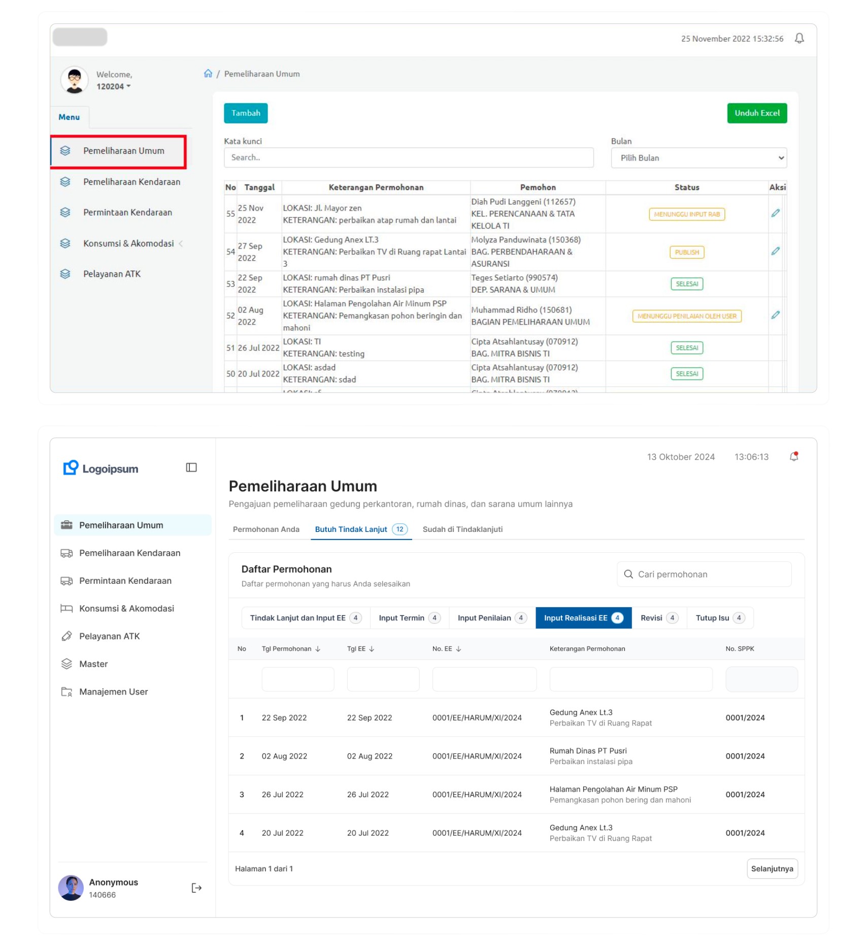
Lack of transparency for requesters: Users who submitted requests could not easily track the progress or status of their submissions, often leading to confusion or unnecessary follow ups.
Limited visibility for other roles: Approvers and technicians had no clear way to see which requests had been followed up, were still pending, or required fast attention.
Unintuitive user interface: The layout and flow made it difficult for users to quickly find relevant information or understand what actions to take.
Although the existing SIAP functional, fell short in delivering a seamless and transparent experience for their users. With multiple roles involved in each maintenance request from submission to resolution, the system faced several issues that affected user experience and overall efficiency:
Lack of transparency for requesters: Users who submitted requests could not easily track the progress or status of their submissions, often leading to confusion or unnecessary follow ups.
Limited visibility for other roles: Approvers and technicians had no clear way to see which requests had been followed up, were still pending, or required fast attention.
Unintuitive user interface: The layout and flow made it difficult for users to quickly find relevant information or understand what actions to take.
Goals
Goals
For this project, I set the goal was to create a solution that not only meets the needs of each user role involved in the this maintenance request process, but also fundamentally improves the convenience, efficiency, and transparency of the system.
For this project, I set the goal was to create a solution that not only meets the needs of each user role involved in the this maintenance request process, but also fundamentally improves the convenience, efficiency, and transparency of the system.
Interface Design
Interface Design
Provide real time request tracking
Provide real time request tracking
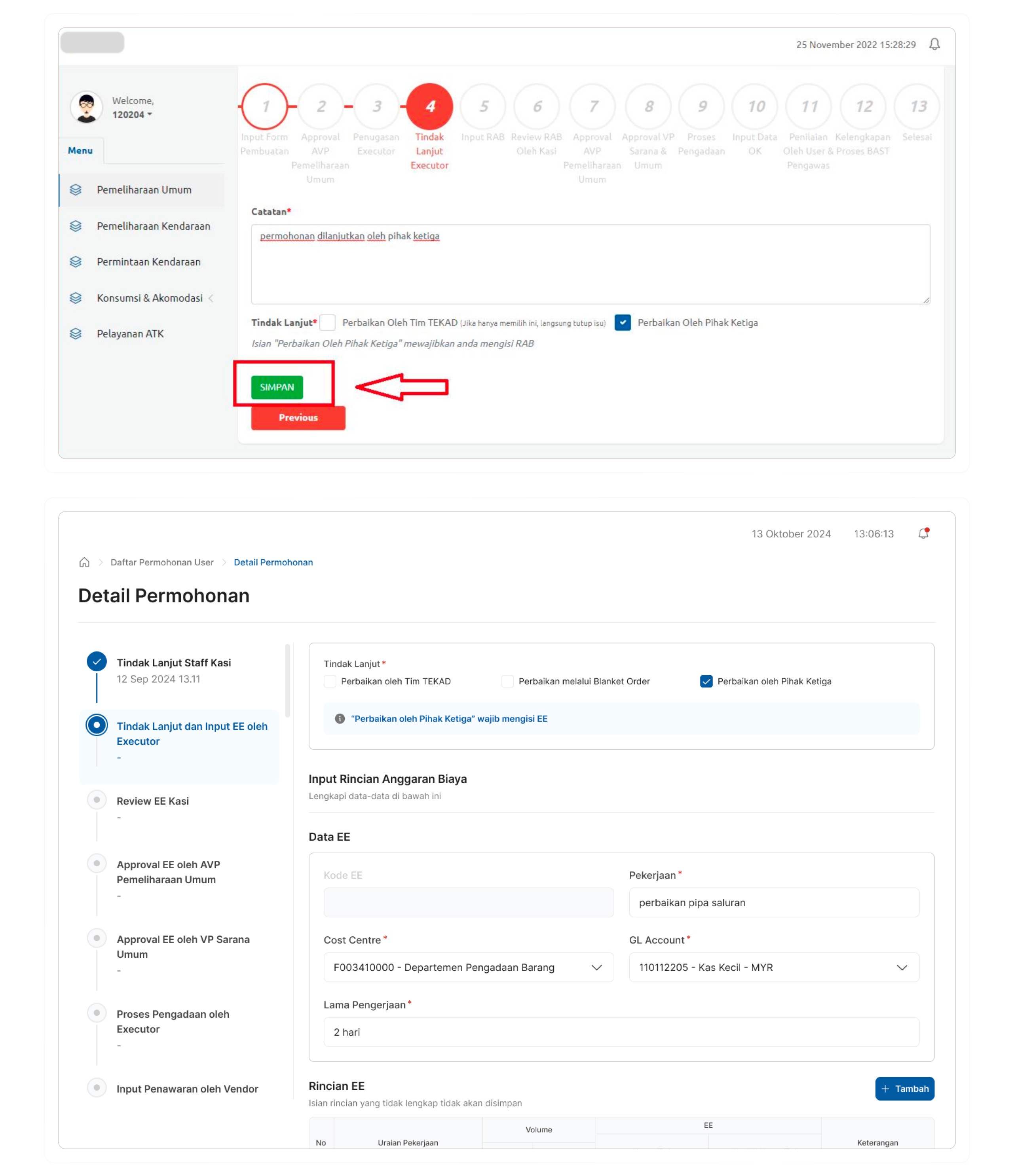
Enable better visibility and design more intuitive
Enable better visibility and design more intuitive
Conclusion
Conclusion
Looking back at this project, throughout the process I focused on understanding how each user interacted with the system and what they needed most. One of the most valuable takeaways from this project was the importance of designing with users, not just for them. Through direct user testing, I was able to validate that the new design significantly make users felt the flow was much clearer and easily understand the next steps in the process.
Also while the interface received a visual and functional upgrade, it did not drastically change how users navigated the system. This balance helped users adapt quickly while benefiting from a more intuitive and transparent experience. If I had more time, I would have added a bit more visual polish to the UI, small aesthetic touches that could further improve the overall experience.
Made with empathy © 2024 Hannah Nur Azzahrah
Made with empathy © 2024 Hannah Nur Azzahrah